Doing the Math to Unlock Intelligence from Supplier Quotes
Are you getting as much business intelligence as possible from the information that your suppliers are already providing? It is standard practice in manufacturing to gather quotes from multiple vendors at several volume levels to ensure the award of a production contract at a market-competitive price.
What doesn’t always happen is the extraction of business intelligence about all of these suppliers’ cost structures. With some math and little extra time, you can make better-informed decisions about when to use selected suppliers based on your needs. In this case study, we’ll show how a manufacturing company can leverage easily available data to achieve significant savings.
Take Another View
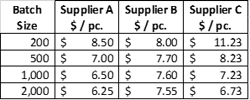
Vendors don’t commonly share their setup costs or what types of jobs they prefer to run. However, if you are asking for piece prices at multiple volume levels, you can easily infer that information. Suppose the supplier quote comes back looking like the table below.
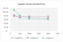
The graph of piece prices shows what we expect: buying more will lead to a lower price per part.
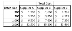
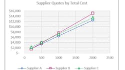
If we view the data differently, there’s more insight to be gained. By multiplying the batch size by the cost per piece, we can understand the total cost, and graph that, as shown below:
When viewed as total cost, the quotes now plot in a straight line. This is consistent with some high school algebra, which you may or may not remember fondly: y = mx + b. This algebraic relationship is the key to the puzzle we’re solving. In our context, the y value is the total cost from the previous chart. The x-value, also from the previous chart, is the batch size. The slope, m, is the production cost per piece and the y-intercept, b, is the setup cost.
Fortunately, Excel will do this math for you. To display the equation, do the following:
1. Select your data
2. Select “Insert Graph > Scatter plot”
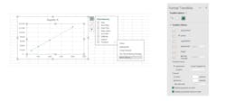
3. Click on the “+” button and Select Trendline > More Options. Alternatively, right click on the plotted line and select “Format Trendline”
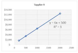
4. Select the checkboxes for "Display Equation on Chart" and "Display R-squared value on Chart"This will product the chart shown below for Supplier A:
Excel also provides a statistic to help with the analysis: R2. R2 = 1 means that all the data points fit exactly on the line: the line perfectly explains all of the quoted volumes. If R-squared is less than 1, there is something else going on. This visually displays as data points that do not lie exactly on the line. Common reasons for this include volume discounts given by their suppliers, minimum order quantities charged to you below a certain volume or dollar amount, or shipping efficiencies based on how much fits on a pallet of full truckload.
Making the Data Work for You
When comparing multiple suppliers we can answer things like:
- Who has the lowest cost setup charges? They may be the best supplier if volumes stay low.
- Who has the lowest cost piece price? They may be best when volumes are very high typically, and may have the best purchasing price for the raw material.
- Are there quotes with non-straight lines? Are there volume discounts in play and if so, at what volume?
Beyond getting a competitive price from a selection of suppliers, your goals may include comparing your organization’s capabilities to that of the selected bidder. If both organizations can make a given part, you are competitors, whether you realize it or not. It is always hard to self-assess, whether individually or organizationally.
Are you making the part inhouse? It should be quoted at those same volumes. Do the Excel analysis to isolate the setup and piece price. These might be known because they drive the quote, but knowledge is often very localized within a large company.
Comparing the internal results to external suppliers:
Do suppliers have an advantage in setup costs?
- We might be using a more expensive machine
- We might be inefficient at setups/changeovers
- The specific part may be atypical compared to what we usually make inhouse, so setups are more complicated/expensive
Do suppliers have an advantage in piece price costs?
- The supplier may have faster machines
- They may have lower labor costs
- They may be getting better pricing on raw materials or shipping
- They may be cutting corners somewhere on quality
- Our cost accounting system may be lying to us
If we now compare our suppliers' cost structure, we can answer some of these questions.
Supplier A has lower costs than Supplier C for both setup and piece price, so we can eliminate Supplier C. We can see that Supplier A will be better for higher volumes due to the much lower piece price. But Supplier B wins for small batches because of extremely low setup costs.
Supplier quotes are an incredibly valuable source of information. Taking a few extra steps to transform that data into business intelligence can also transform your understanding of which vendor is the best fit for current and future contract awards. It might even shine a spotlight on your own operations and allow you to benchmark your cost structure against the competition.
Kevin Carson is a principal with Firefly Consulting. He has spent more than 25 years working with clients on operational excellence, delivering impactful results that cross industries, corporate cultures, and geographies.
To comment on this article, please scroll down past story recommendations to "Voice Your Opinion."

